
Back in high school when I was campaigning for student body president I thought it was such a GENIUS idea to use sidewalk chalk advertising. It's cheap and people notice it. Some down sides are it's a little messy, and if the weather is bad- you're out of luck. But what if you lived in sunny california? The coastal boardwalks provide ample foot traffic where your ads would get noticed.
Water stenciling, also know as "reverse graffiti" or "green grafitti" is a fairly new form of advertising that allows brands to get their ad across by virtually power washing sidewalks. People use high-pressure water guns and stencils, which cleans the sidewalk and provides a new ad. Some of the first companies to use this form of advertising are GreenGraffiti (Amsterdam), CURB (London), & GoGorilla Media (New York).
Monday, November 15, 2010

Tuesday, November 2, 2010
Excess Baggage
I like how Muller pushed the idea of how annoying it is to be charged for bags on airlines. Muller took it to the next level when they moved outside of the airline industry and into taxi cabs. It forces the customer to remember how shocking it was when airlines started charging for bags. This ad highlights how ridiculous bag fees are! I hope the taxi industry doesn't adopt this trend.
Austin's GSD&M Idea City, exaggerates the benefit with their "Bags Fly Free" campaign. According to an article in Insidethatad.com:
" 'Bags Fly Free' has proven to be a strong marketing campaign for Southwest, and the airline believes it is a major reason that Southwest has gained market-share in domestic airline service, said Kevin Krone, Southwest’s vice president of marketing and sales distribution. Momentum has built since many leisure travelers fly infrequently and are still adjusting the hefty fees that other airlines are charging to check baggage."
Both Ad Agencies use mockery to say their airline has overall cheaper flights. I like how Southwest emphasized all bags fly free. The Southwest spots talk more about the benefit because they literally say "bags fly free" numerous times throughout the commercial. Whereas JetBlue focuses too much on the ridiculousness of charging extra for bags...it doesn't sell the benefit as well as GSD&M. Muller's tagline is also misleading "Check your first bag for free"- it doesn't seem like such a great deal after all. I do give Muller credit for making a funny ad, but in the end Southwest allows you to bring more bags for your buck.
Tuesday, October 12, 2010
Stella Artois- MOTHER
This ad puts a clever twist on what happens when a guy brings a girl home. He shows off his cool gadgets and woos her. But this time, she is engulfed by the gadgets and the beer prevails to be what the guy really wants. As a woman, I'm not offended by this ad. I think it could go both ways- it could have easily been set in a woman's apartment and the guy could have been eaten by the couch. I'd like to see more like this but with different scenarios. Perhaps a man proposes to a woman in a very extravagant way- and instead of wooing over the ring/proposal she is more excited by the stella that he gives her before the proposal. It could also be a great interactive ad on a website. It'd be fun to click around the apartment and play with the different gadgets and see how creative/subtle the art director could be with product placement.
Thursday, July 29, 2010
Texture_1

A thick wooden Indian sculpture seems appropriate to start the design blog off. This rounded belly fella is a God, noted by his many arms.
Texture_2


The crackled walls are a product of weather and time. It's an antique look that many in the US try to imitate with sandpaper & other "foe finishes".
Texture_3

This is one of the few things I photographed in Agra besides the Taj Mahal. I'm not sure if the truck works, but the rusted exterior gives it character.
Texture_4

I wish I could take one of these old Indian doors home with me. Why would you ever buy something at Pottery Barn? To attain this rustic look just find some old wood and hammer in some nails and rust!
Texture_5

If you look closely at the figures you can make out they are wearing long dresses. It is probably a painting of farm women carrying water or tending to the field.
Pattern_1

The criss-crossed metal bars create a geometric pattern on this door. I like how the background had geometric shapes as well, adding to the depth and busyness of the pattern.
Pattern_2

We went to a marble factory in Jaipur. They did a demo and showed us how each slab was hand cut and intricately placed with semi-precious stones. One of the stones illuminates when light is placed under it. Would make for a great outdoor patio table!
Pattern_3

Here is a classic example of clashing patterns! At least he wasn't wearing the drape or rug. Despite the dizziness of the patterns, the gold, red and blue color palate compliments each other.


Negative Space

The sky between the dark arch in the foreground and the building in the background lets your eyes breathe for a while. You're not forced to look just at the decorative arch, or the arches in the distance, but the space lets you make the relationship at your own pace.

Since the "negative space" is filled with background colors, I think the black is actually the void of space.
Figure Ground

This was an astrological map. What was neat about is the map was cut in half so scientists could walk between the map. As far as design principles there is a great push and pull of space between the white and the stairs in the background. The radial lines and grid add to the complexity of the composition.
Grid System

Natural grid system vs. Man made chains.

Both grids set a frame for a building (a humble house and a not so humble tomb- The Taj).

A dinosaur theme park grid system! Found this at a mall in Mumbai. It's my favorite grid system because it's playful & there are lots of diffrent grids/systems 1) The Dinosaur bones 2) the animals 3) The leaves 4) the farm background 5) The actual geometric grid/lighting.
Hierarchy

There are a series of hierarchies going on in this moment. We stopped on the side of the road in Mt. Abu to take some pics of the monkeys when a car of locals brought out some food. The monkeys flocked the food (as well as their car!) It was an interesting sight because the humans had power over the mother with their food, but the monkeys also were trampling on their car. The mom was the dominant animal protecting her baby both from hunger and harm of the humans (aka our flashing cameras).
Eyeflow (Continuous)

The eye follows the extreme drop downwards.

I call this one "Underwear man". The horizontal strings of lingerie allow your eye to playfully travel across the page and then spirals back into the abyss of under garments.
Gestalt
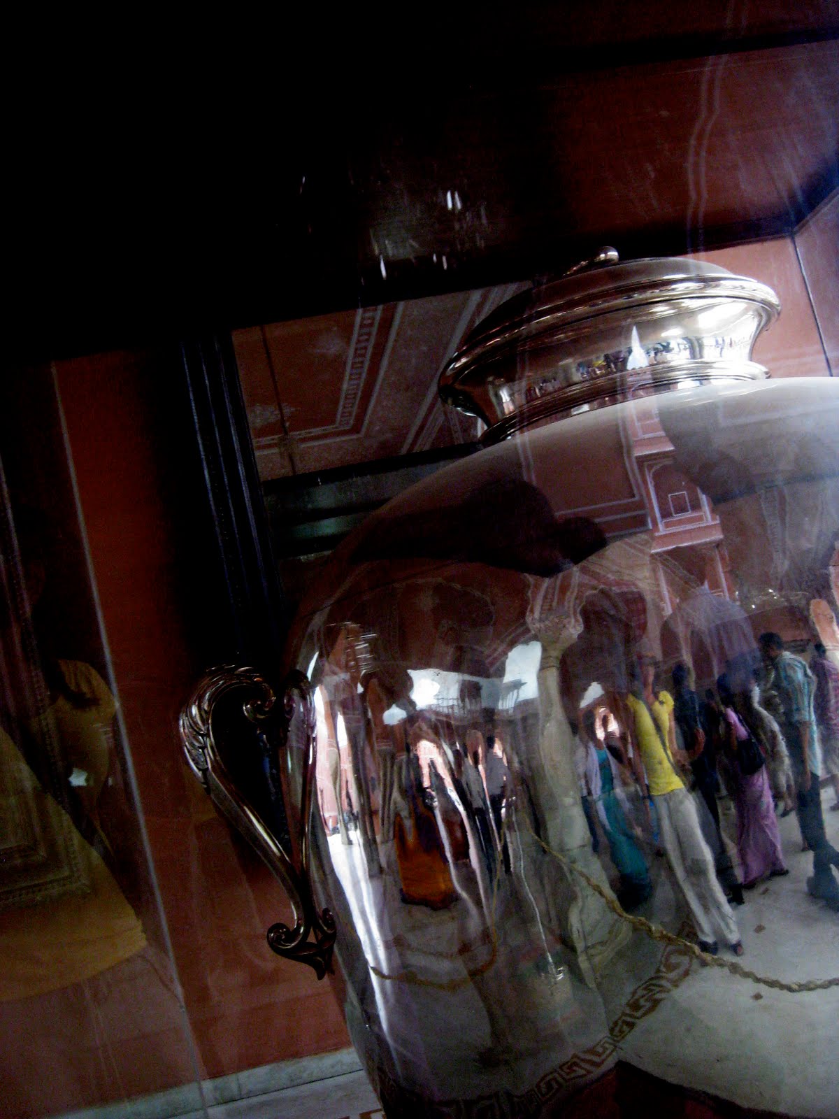
This over sized silver jug was at a Palace in Jaipur. I liked the sharpness of the silver and the blurriness of the figures reflected in the jar (I'm in yellow). There's also a greater visual in the background, the mirror behind the jar is reflecting the ceiling.
Alignment

It doesn't seem like the chandeliers are perfectly aligned because of the camera angle, but they are nicely matched up with the points on the arches. The scale of the chandeliers helps distinguish the alignment as a recession into space.
Subscribe to:
Posts (Atom)